5 steps to a simple but great looking website
Web design and development is a huge industry that from the outside can look overly-complicated.
And sure, it can be. A lot of websites do need the technical know-how behind the scenes to make them operate the way they need to, especially if they're having to run huge amounts of data or support thousands of unique visitors at any given moment.
But what if you're just after a simple website for your business, that showcases your products and services and directs potential customers to your contact you, but have no idea where to begin? This article is for you.
Step 1 — Know your content
The first step is simple – know what needs to be included on the site. Write up a list of pages that you'll require, and under these headings, write the content that will appear on each of these pages. You don't need to know how to display it correctly, you just need to get those words down.
Tip: use keywords that you think will direct people to your site if they're searching for that topic on Google. If you want people coming to your site for the right reasons, using the right key words will get you more hits on your site.
This is also a great time to collate any media content – videos and imagery – that would be effective and visually appealing to display on your new site.
Step 2 – Match your branding
Go find that pdf of your branding guidelines, because you're going to need it!
Branding guidelines need to be on hand before you build your website.
A lot of the time people seem to think there is a divide between your branding collateral and your website, but that shouldn't be the case. Implementing your existing branding across your new site makes everything consistent. When people see your new site, they will immediately recognise it as your brand.
Have the colour palette hex codes, high resolution logos, and fonts ready to upload and use across the site.
Tip: For any videos and imagery being used, applying the same photo filter to everything helps create a unified look across the website, without anything sticking out like a sore thumb.
Step 3 – Construction
This is the big step, but you're ready, I promise. Using one of the many website creators that are available online is the best way to construct a site easily and inexpensively. We personally recommend Squarespace, as it is the most user-friendly, with a drag-and-drop interface and, most importantly, it optimises your site to perform best in terms of functionality, appearance, and SEO.
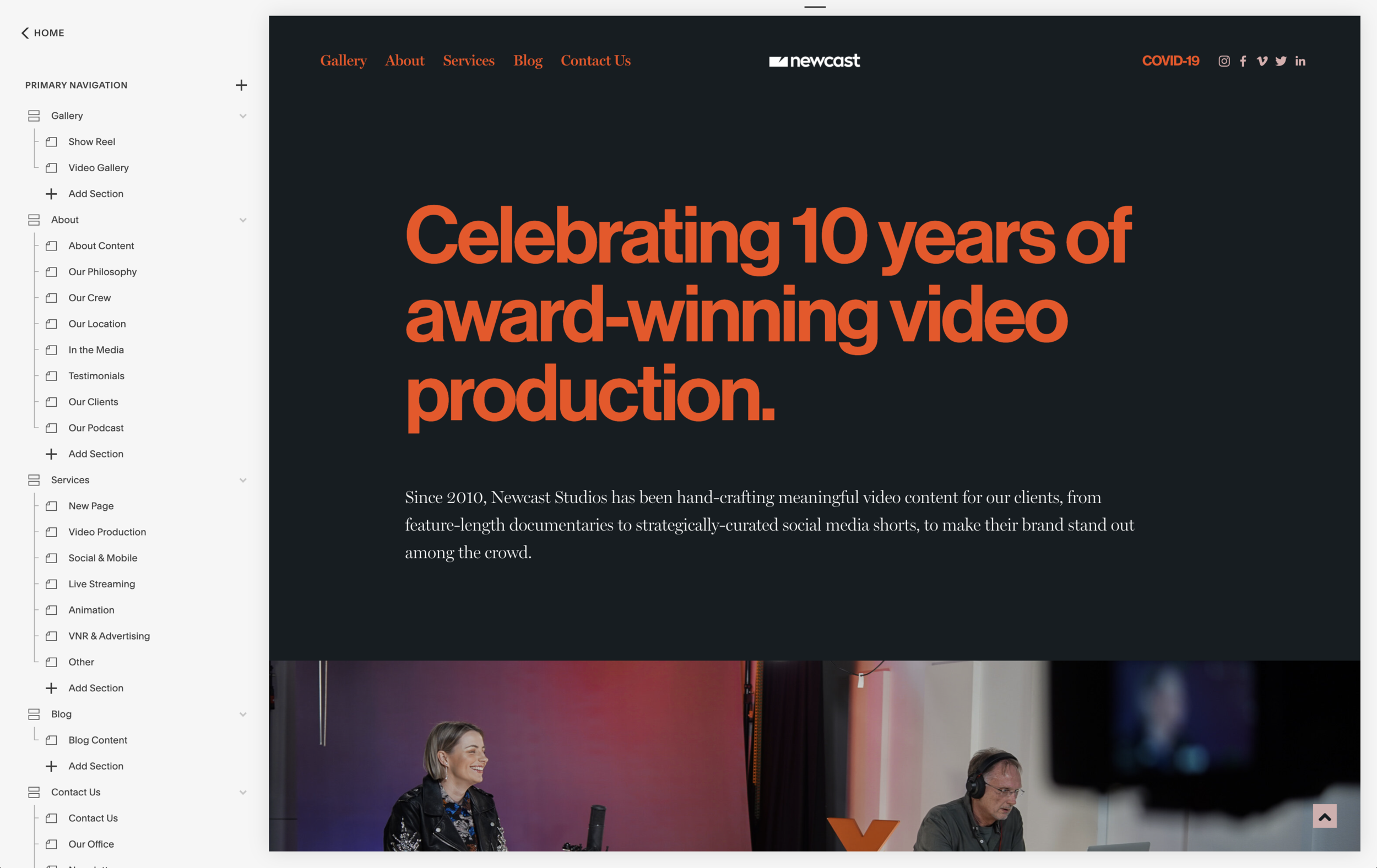
The Squarespace dashboard
Of course there are other options out there – in the past we have used Wordpress, although the backend can be overly complex if you're new to website building. Even Wix is not as bad as it notoriously used to be. Or, if you're looking to go straight for an online shop, Shopify both sets up an online store but connects you to the right features and functions to make your shop operational.
When it comes to Squarespace, it really is as simple as choosing a theme, adding pages, chucking the content in and positioning it the way you want it to appear. The pages panel is where you add all your pages and content. You can choose if pages are hidden, which menus they appear in, what the names of the URLs and link titles are, and really put your whole site together.
The Design panel helps you set up the look, but simply clicking on elements and changing the fonts and colours in an easy to use menu. Here you can choose pretty much how everything will look, how it is spaced and how it will look on mobile.
There is also a Commerce panel if you're looking to link up your payment details for an online shop.
Constructing a website becomes time-consuming to perfect but all the time spent is well worth it if it means getting people actively scrolling through your site and actually making conversions to contact you or buy your products.
Step 4 – Backend
This is where things get a little bit trickier, but they don't have to be. Firstly, make sure to have all your links working across the site, and displaying the way you want. Keeping the URLs for these pages simple also helps with SEO.
Then, utilising keywords on all your pages and image files helps your website pop up in Google organically. There are certain rules about how many words you should include per page, what kind of words in terms of content and form, so looking up basic SEO rules to follow will help you enormously.
Step 5 – Go Live
Before you go live, get a whole bunch of people you trust to go through the hidden or locked site and make sure everything single link works, every single image, video, etc. Make sure there are no spelling errors too!
Test it out on different displays, devices, browsers – make sure it looks the way you want it to wherever it could show up!
Then… you’re live!
Tip: having podcasts or blog posts scheduled to post on the site, and scheduled to post on social media, will not only help your website achieve a higher place in Google (the Google bots scan websites regularly, and those with new content churning out get placed higher) it’ll also get people coming back to your site for more every month or even week.
Check out our websites for Newcast, Lonsdale St. Studio, WSNC Swim and Channel K to see the potential designs and options you can have with your own website.


